
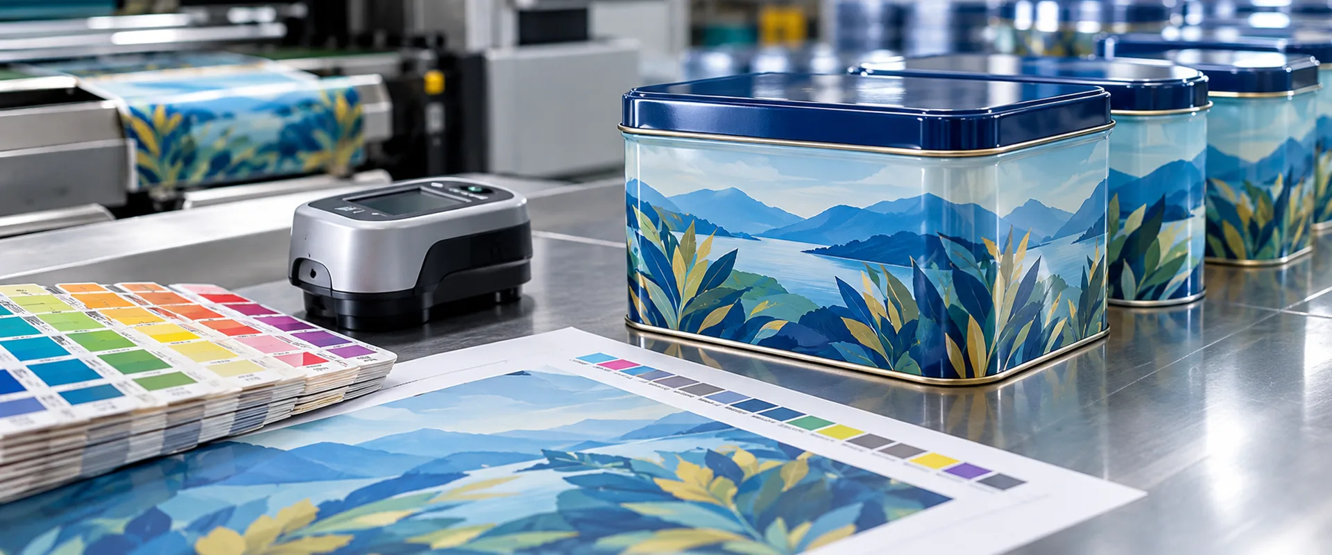
Tin box printing color consistency depends on the interaction between the tinplate surface, ink system, white ink coverage, curing conditions, and protective coating. A correct CMYK value or Pantone reference does not guarantee that the finished metal package will match a paper proof or a sample produced under different conditions.
For packaging engineers and quality teams, the main task is to establish a reproducible reference and define how color variation will be measured and accepted. The specification should cover the printed substrate, white ink construction, surface finish, viewing conditions, and color tolerance before mass production begins.
Table of Contents
TL;DR: Tin Box Printing Color Consistency
- Approve critical colors on a representative tinplate sample with the intended white base and protective coating.
- Specify whether the artwork uses Spot White or Full White, and identify the exact areas requiring white ink.
- Use D50 viewing conditions for controlled visual assessment where appropriate, and document the lighting and observation method.
- Use CIELAB measurements and the CIEDE2000 (ΔE₀₀) formula when an objective color-difference limit is required.
- Define coating requirements separately from color tolerance. Changes in gloss, coating coverage, or surface texture can affect perceived color.
- Retain the approved sample and artwork revision as the reference for repeat production.
Why Tin Box Printing Color Consistency Is Difficult to Control

Tinplate is a reflective metal substrate rather than a naturally white printing surface. Its reflectance can influence the appearance of transparent or partially opaque inks, particularly in large solid-color areas, logos, and designs that combine printed graphics with exposed metal.
The same nominal ink color can therefore look different on white paper, coated tinplate, and bare metal. A color that appears neutral on paper may take on a cooler or more metallic appearance when printed directly onto tinplate.
Surface geometry introduces another variable. A flat panel, rounded corner, embossed logo, and curved sidewall may reflect the same illumination differently. The resulting visual difference does not necessarily indicate a change in ink formulation.
Tinplate Surface and White Base Coverage
The white base layer determines how much of the underlying metal influences the printed color. Where opacity is insufficient, the metal can affect the apparent lightness, saturation, and hue of the overprinted ink.
This matters most when the design contains light colors, large solid backgrounds, or brand colors that must remain visually consistent across different package sizes.
Before approving the artwork, the buyer and manufacturer should identify which areas require an opaque white base and which areas are intended to retain the metallic appearance. These instructions should be recorded in the print file rather than left to interpretation during production.
Spot White vs. Full White in Tin Box Printing
Spot White and Full White describe different white-ink coverage strategies. They should not be treated as interchangeable artwork instructions.
| Print construction | Coverage | Typical purpose | Main control point |
|---|---|---|---|
| Spot White | White ink is applied to selected areas | Supporting logos, text, or specific color regions while leaving other metal areas exposed | Accurate white-layer separation and registration |
| Full White | White ink covers the specified overall print area | Creating a more uniform base for subsequent colors | Coverage uniformity, opacity, and compatibility with the coating system |
| No white base | Colored ink is applied directly to the metal surface | Producing metallic or translucent color effects | Approval of the intended metal-influenced appearance |
Spot White usually requires a separate white-ink separation or plate according to the printing process. The artwork should identify the white areas clearly, often using a dedicated spot-color channel or named separation. The actual naming convention and file setup must follow the manufacturer’s prepress requirements.
Full White refers to broad or overall coverage of the designated printed area. It does not necessarily mean coating every surface of the finished tin. Unprinted metal borders, seams, and other excluded areas may remain exposed according to the approved layout.
A white layer can also affect the apparent color of the ink printed over it. Changes to the white ink’s coverage, opacity, or registration may therefore produce visible differences even when the CMYK values remain unchanged.
Artwork Separation and Registration
The white-ink layer should be checked against the colored artwork before the printing plates or production files are released. If the white area is misregistered, a narrow metallic edge may appear beside a logo or colored panel. On small text and fine graphics, the same error can affect edge definition.
The required registration tolerance depends on the printing process, artwork dimensions, and package geometry. It should be established with the manufacturer rather than assumed to be identical for every design.
CMYK and Pantone Color Matching on Tinplate
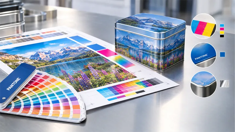
CMYK process printing combines cyan, magenta, yellow, and black inks to reproduce multicolor artwork. It is commonly used for photographs, gradients, illustrations, and designs with many colors.
Pantone spot colors provide a defined reference for selected colors, such as corporate logos or solid brand panels. A Pantone code is useful for communicating the target color, but it does not remove the influence of the substrate, white base, coating, and printing conditions.
A paper Pantone guide should not be treated as a guaranteed visual match for a finished tin box. The guide and the tin differ in surface reflectance, gloss, and material construction.
For a critical brand color, the specification should identify the Pantone reference, the intended print construction, the finished surface, and the approved physical sample. If the artwork uses CMYK for photographs but Pantone for a logo, the logo should be identified as a critical color rather than evaluated only as part of the overall image.
Where CMYK and spot colors are combined, the production file should clearly identify each color separation and the areas where inks overlap. Unclear separations can lead to unexpected color interactions or inconsistent coverage.
Measuring Color Difference with CIELAB and ΔE₀₀
Visual inspection is necessary, but it can be difficult to compare subtle color differences consistently between operators, shifts, or production batches. Instrumental color measurement provides a numerical method for evaluating differences between a sample and an agreed reference.
The CIELAB color space describes color using three coordinates:
- L* represents lightness.
- a* represents the green-to-red axis.
- b* represents the blue-to-yellow axis.
The CIEDE2000 formula, commonly written as ΔE₀₀, calculates color difference from CIELAB values using corrections designed to better reflect differences in human color perception. The method is specified in ISO/CIE 11664-6:2022. https://www.iso.org/standard/82662.html
A lower ΔE₀₀ value generally indicates a smaller calculated difference under the specified measurement conditions. However, the result should not be interpreted independently of the substrate, surface finish, measurement geometry, and agreed acceptance criteria.
Setting a ΔE₀₀ Acceptance Limit
There is no single ΔE₀₀ limit that is appropriate for every tin box. A tolerance suitable for a decorative design may not meet the requirements of a brand owner with strict color controls.
The buyer and manufacturer should define the acceptance limit for critical colors before production. The specification should state:
- The approved reference sample or reference measurement.
- The color measurement instrument and measurement geometry.
- The illuminant and observer settings used by the instrument.
- The location and number of measurement points.
- The agreed maximum ΔE₀₀ value.
- The treatment of metallic, textured, curved, or highly glossy areas that cannot be measured reliably using the same setup.
For example, a project specification might require a maximum ΔE₀₀ of 2.0 for a selected flat brand-color panel. This is an illustrative project requirement, not a universal tin packaging standard. The appropriate limit must be validated against the product, substrate, measurement method, and visual acceptance requirements.
A measurement from a single point may not represent the entire panel. Where coverage variation is possible, several predefined points can help distinguish a consistent color shift from uneven printing.
Measurement on Glossy or Metallic Surfaces
Glossy varnish and reflective tinplate can influence color measurements. The instrument’s measurement geometry, inclusion or exclusion of specular reflection, and the position of the sample must be controlled.
For curved walls, embossed panels, and small logo areas, the measuring aperture may not fit entirely within the intended color region. In those cases, visual comparison under controlled conditions may be more practical, or a separate measurement method may need to be agreed upon.
Color readings from different instruments should not automatically be treated as equivalent. If the reference and production samples are measured using different equipment or settings, the resulting ΔE₀₀ values may not provide a reliable direct comparison.
D50 Viewing Conditions for Color Approval
The appearance of a printed color changes with the illumination under which it is viewed. A sample inspected under warm office lighting may appear different from the same sample viewed under daylight or another light source.
D50 is a standardized illuminant representing a phase of daylight with a correlated color temperature of approximately 5,000 K. ISO 3664:2025 specifies viewing conditions for evaluating reflective and transmissive images, including printed materials. https://www.iso.org/cms/live/live/en/sites/isoorg/contents/data/standard/08/37/83759.html
For color-critical tin box printing, D50 viewing conditions can provide a controlled basis for comparing the approved sample and production output. The viewing environment should also limit distracting reflections and surrounding colors that could influence visual judgment.
A D50 viewing booth does not eliminate every source of variation. Metallic surfaces may still produce angle-dependent reflections, and the finished package may look different under the lighting found in a shop, warehouse, or retail display.
For this reason, color approval should distinguish between controlled comparison conditions and the expected appearance in actual use. If the package will be displayed under a specific lighting environment, that requirement should be recorded separately.
How Coating Thickness and Surface Finish Affect Color
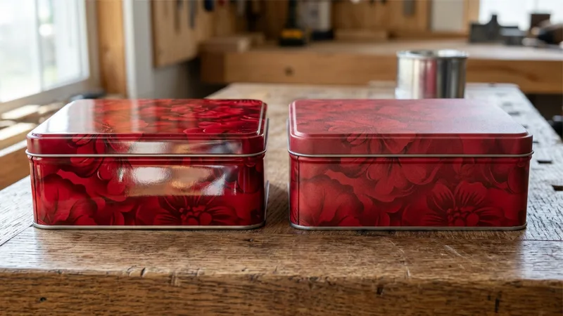
The protective coating applied over printed tinplate affects more than durability. It can change gloss, surface reflection, and the perceived depth of the printed color.
A gloss varnish may produce a more reflective surface, while a matte finish diffuses reflected light differently. Even when the underlying ink color remains similar, these finishes can make the package appear visually different.
Coating thickness is a process parameter that should be specified according to the coating material, application method, curing conditions, and performance requirements. It should not be assigned an arbitrary universal value for all tin box printing jobs.
Where coating thickness is a critical control, the specification should identify the relevant measurement method and whether the requirement refers to wet film, dry film, or another defined property. The measurement method must be appropriate to the coating system and substrate.
Separate Color Acceptance from Coating Acceptance
Color and coating requirements should be evaluated as related but distinct characteristics.
| Characteristic | What to check | Why it matters |
|---|---|---|
| Color difference | CIELAB values and agreed ΔE₀₀ limit | Identifies deviation from the approved color reference |
| White base coverage | Opacity and coverage in specified areas | Influences the appearance of overprinted colors |
| Gloss | Agreed gloss level and measurement method, where applicable | Changes the way light reflects from the finished surface |
| Coating condition | Coverage, curing, adhesion, and other specified properties | Affects the final surface and product performance |
| Print registration | Alignment between color separations and white ink | Prevents visible edges, halos, or misalignment |
A sample can meet the color tolerance but fail a coating requirement. Conversely, a coating may meet its own specification while the printed color falls outside the agreed limit. Keeping separate acceptance criteria makes the inspection result easier to interpret.
Controlling Batch-to-Batch Color Variation
Repeat production introduces the risk that a new batch will differ from the original approved sample. The difference may arise from artwork revisions, a changed white base, a different coating specification, or variations in printing conditions.
The inspection process should compare the new batch against the retained reference using the same measurement and viewing procedures. The approved artwork revision must also be checked before a color deviation is attributed to the printing process.
A practical control sequence is:
Artwork verification → white-layer confirmation → physical color approval → production inspection → comparison with retained reference → acceptance or corrective action.
If a deviation is detected, the investigation should begin with the affected area and the relevant process variables. A logo that appears darker may require a check of the white base, ink coverage, surface coating, and measurement conditions before the ink formulation is changed.
Changing the ink to compensate for a difference caused by the white base or varnish can introduce a second problem. The cause should be identified before a corrective adjustment is approved.
Example: A Repeat Order Has a Darker Brand Color
Suppose the approved sample uses a white base beneath a blue logo. The next production batch appears darker, even though the blue color values in the artwork have not changed.
The inspection team should compare the two artwork revisions and confirm the white-ink separation. It should then check whether the coating and measurement conditions match the approved reference.
If the white base has changed or the finished gloss differs, the perceived color shift may not be caused by the blue ink itself. Correcting the underlying process difference is preferable to changing the color formulation without evidence.
The investigation should record the reference sample, the observed deviation, the verified cause, and the approved corrective action. This record also provides a basis for evaluating later repeat orders.
Tin Box Printing Color Consistency: RFQ and Inspection Requirements
A color-sensitive RFQ should define the intended appearance and the method used to judge conformity. A Pantone code alone may be insufficient when the design combines white ink, transparent colors, metallic effects, and protective coatings.
The specification should include the following information:
- Artwork file and revision number.
- CMYK values and Pantone references for critical colors.
- Spot White or Full White coverage instructions.
- Areas intended to retain exposed metal.
- Required coating or varnish type and surface finish.
- Physical color reference and approval status.
- Measurement method and agreed ΔE₀₀ acceptance limit, if instrumental measurement is required.
- D50 viewing requirements or other agreed visual assessment conditions.
- Defined sampling locations and inspection frequency.
- Procedures for handling deviations and approving corrective changes.
These requirements should be confirmed before mass production. If a color specification changes after approval, the revision should be reviewed to determine whether another proof or sample approval is necessary.
Conclusion
Tin box printing color consistency requires control of the complete print construction rather than the ink color value alone. The substrate, white ink coverage, color separations, protective coating, viewing conditions, and measurement method all influence the result.
A reproducible process begins with an approved physical reference and a documented artwork revision. Critical colors should have defined acceptance criteria, while white ink, coating, gloss, and registration should be inspected against their own requirements.
When these controls are established before mass production, color deviations can be investigated using consistent evidence instead of subjective judgment or unnecessary ink adjustments.
Frequently Asked Questions
Why does my tin box color look different from the artwork on screen?
A screen emits light, while printed tinplate reflects it. The metal surface, white base, ink system, protective coating, and viewing illumination all influence the finished appearance. A physical sample is therefore a more suitable production reference than a screen image alone.
What is an acceptable ΔE₀₀ value for tin box printing?
There is no universal acceptance limit for every tin box. The buyer and manufacturer should agree on the limit for each critical color, together with the measurement instrument, settings, sample locations, and reference standard.
What is the difference between Spot White and Full White?
Spot White applies white ink to selected areas, allowing other regions to retain their metallic appearance. Full White provides broad coverage across the designated print area to create a more uniform base for subsequent colors. The exact coverage must be defined in the approved artwork.
Why should color samples be checked under D50 lighting?
D50 provides a standardized daylight-like viewing reference for printed materials. Controlled lighting reduces differences caused by inconsistent illumination, although reflective metal and curved surfaces can still appear different at different viewing angles.
Can coating thickness affect tin box printing color consistency?
Yes. The coating system and its application can influence gloss, reflection, and perceived color. Coating thickness should be controlled according to the applicable process specification, while color conformity should be evaluated against its own agreed reference and tolerance.