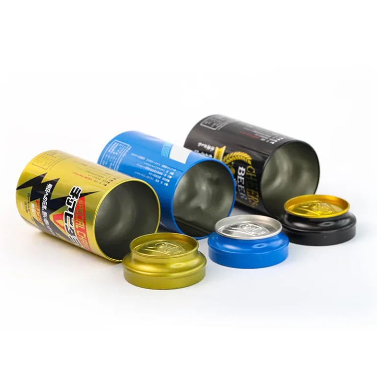
When buyers compare a Metal Tin Box, they often focus on size, shape, and printing. But in real-world packaging, finish is what customers touch first, what cameras capture on shelves, and what protects your branding during shipping. The right finish can make a simple tin feel premium, improve scratch resistance, reduce fingerprints, and even help your box stay compliant for food or cosmetic applications.
In this guide, you’ll learn the most popular Metal Tin Box finishing options—matte, glossy, satin, textured, metallic, soft-touch, spot UV, and more—plus how to choose the best combination for your product, market, and budget. You’ll also see how professional buyers specify finishes clearly, so the factory can deliver consistent results from sample to mass production.
Table of Contents
Why the Finish Matters for a Metal Tin Box
A finishing layer is not just “decoration.” It’s a functional system that can include a base coating, printing inks, and a topcoat (varnish or lacquer) that controls gloss, texture, and protection. When you choose the right finishing system, your Metal Tin Box becomes more durable, more recognizable, and easier to sell.
Finish decisions also affect lead time and cost. Matte and soft-touch effects may require special varnishes, careful curing, and extra quality checks, while glossy varnish is often simpler and faster in mass production. The key is to match the finish to how the tin will be displayed, handled, and transported.
Finish influences first impressions and brand positioning
People judge “premium vs. standard” in seconds. A matte or soft-touch tin often reads as modern and high-end, while a glossy tin can look bright, playful, and gift-ready. Even if the structure is identical, finish alone can change how a buyer perceives value.
Finish is also critical for photography and e-commerce. Matte reduces glare under studio lights, while glossy can create strong highlights that either look beautiful or distract from the design. If your sales rely on online images, you should plan your finish with camera performance in mind.
Finish affects protection in logistics and retail handling
A Metal Tin Box goes through stacking, friction, and vibration during shipping. It also gets opened and closed many times in retail and consumer use. A good protective topcoat improves scuff resistance, rub resistance, and stain resistance, so the graphics still look sharp after weeks of handling.
If your tin will be used long-term (keepsake storage, tool tin, collectible packaging), durability becomes part of the product promise. In those cases, the finish is not a “nice-to-have”; it’s a core requirement.
Understanding the Finishing System: From Tinplate to Topcoat
Most Metal Tin Box bodies are made from tinplate (steel with a thin tin coating) or sometimes tin-free steel. The substrate is only the starting point. What buyers call “finish” is usually the final appearance and feel created by coatings and varnishes on top of the metal.
A typical finishing stack can include primer, base coat, inks, and varnish. Each layer plays a role in adhesion, color accuracy, corrosion resistance, and final gloss. If one layer is mismatched, you may see peeling, poor color, uneven gloss, or faster wear.
Internal coating vs. external finish
External finishes focus on branding and wear resistance. Internal coatings focus on product safety and corrosion protection, especially for food, candy, tea, spices, balms, or powders. For food-contact packaging, buyers often request specific internal lacquers and compliance documentation aligned with local regulations (for example, EU food contact materials guidance from the European Commission: https://food.ec.europa.eu/safety/chemical-safety/food-contact-materials_en).
Even when your product is not food, internal coating still matters. Some products release oils or solvents, and unprotected metal can discolor or corrode over time. A well-chosen internal lacquer helps keep both the tin and the contents stable.
Curing and consistency are as important as the coating type
Two tins can use the same varnish name, yet look different if curing conditions vary. Temperature, line speed, and coating thickness change how a matte varnish scatters light or how glossy varnish reflects it. That’s why professional sourcing always includes a physical sample approval, not just a written description.
Consistency also depends on printing method and process control. For large-volume projects, factories typically rely on proven offset printing + varnish systems to keep color and gloss stable across batches.
Gloss Levels Explained: Matte, Satin, Semi-Gloss, and Glossy
“Gloss” is basically how strongly a surface reflects light. A high-gloss surface reflects light like a mirror, while a matte surface scatters light to reduce shine. Many industries measure gloss using standardized methods (for example, ASTM D523 is widely used for spec gloss measurement: https://www.astm.org/d0523).
For packaging, you don’t need to memorize numbers. But you do need a shared language—matte, satin, semi-gloss, gloss—plus a sample that defines the target. This avoids misunderstandings like “my matte is not your matte” across different suppliers.
Choosing gloss level based on how customers see your box
If your Metal Tin Box sits under strong retail lighting, glossy can look energetic but may create glare. Matte looks calmer and more premium, but can show scuffing more easily if not protected well. Satin is often the “safe middle,” giving a refined look without high glare.
If your tin is sold as a gift item, glossy can make colors pop and feel festive. If it’s a minimalist brand, matte or soft-touch often matches the design language better.
Gloss level interacts with color and printing
Glossy varnish usually increases perceived color saturation because it reflects more light uniformly. Matte can make colors appear softer or slightly muted, which may be perfect for luxury branding but not ideal for bright, playful artwork. If color accuracy is critical, you should approve both a printed proof and a finished sample under your target lighting.
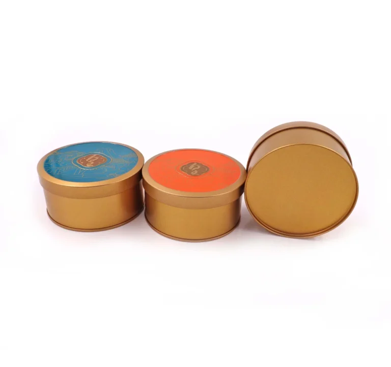
Matte Finish for a Metal Tin Box

Matte is one of the most requested premium looks for a Metal Tin Box. It feels modern and understated, and it photographs well because it reduces glare. Matte is also popular for cosmetics, wellness products, premium tea, specialty coffee, and gift packaging that aims for a “quiet luxury” aesthetic.
That said, matte finishes need proper protection. A matte surface can be more vulnerable to visible scuffs, rub marks, or “polishing” in high-contact areas if the varnish is not formulated for wear resistance.
What matte looks like and where it works best
Matte finish gives you a smooth surface with low reflection. It highlights fine design details like thin lines, subtle gradients, and minimalist typography. It also helps embossing and debossing feel more tactile because the surface isn’t competing with glare.
Matte is especially effective when the tin is the “main product,” not just a disposable package. People keep matte tins on desks or shelves because they feel like a designed object.
Pros and trade-offs of matte
Matte reduces fingerprints compared to high gloss, and it improves readability under lighting. But matte can show scratches as white lines if the topcoat is not strong enough, especially on darker colors. If your tin will ship long-distance or be stacked tightly, consider a higher-durability matte varnish or add protective packaging to reduce friction.
Matte also requires stricter process control. Small changes in varnish thickness or curing can shift the perceived matte level, so sample matching is important.
Glossy Finish for a Metal Tin Box
Glossy finish is the classic retail look for a Metal Tin Box. It makes colors vivid, supports high-contrast graphics, and feels familiar to consumers across candy tins, biscuit tins, seasonal gift tins, and promotional packaging. Glossy is often a reliable choice when the product needs strong shelf impact.
Glossy finishes usually have good wipe-clean performance. If the tin might get dusty, oily, or handled frequently, gloss can be easier to maintain visually.
Where glossy is the best choice
If your design relies on bright CMYK colors, strong gradients, or photo-like images, glossy varnish amplifies the effect. Glossy also looks great with metallic inks and reflective design elements because it enhances light play. For holiday or limited-edition tins, glossy can deliver the “gift sparkle” shoppers expect.
Gloss can also reduce the visibility of minor scuffs in some cases because the reflection can hide small surface changes. But deep scratches are still visible, especially under strong lighting.
Things to watch with glossy
Glossy tins can show fingerprints more clearly, particularly in dark solid-color areas. If your box is designed to be handled frequently (like a daily-use tea tin), you may want a satin finish or anti-fingerprint topcoat instead. Gloss also creates glare in photography, so product images may need careful lighting control.
Satin and Semi-Gloss: The Balanced Option
Satin (sometimes called semi-matte or low-gloss) sits between matte and glossy. It gives a refined look without strong glare, while still keeping colors lively. Many brands choose satin when they want a premium feel but need better wear performance than a delicate matte.
Satin is also a smart option when you have multiple design elements on one tin. It keeps the overall look calm, while you can still add contrast using spot UV or metallic highlights.
Why satin is popular for B2B packaging
Satin is flexible across industries. It works for confectionery, supplements, electronics accessories, hardware kits, and promotional tins. Because it doesn’t lean too strongly into “luxury matte” or “high-gloss gift,” satin can fit many brand styles with fewer risks.
It’s also a practical choice for large-volume orders. Satin finishes often run smoothly in production with predictable appearance and fewer visible defects.
Pair satin with selective effects
Satin becomes especially powerful when combined with spot UV (gloss highlights) or embossing. You can keep the body satin, then add glossy logos or patterns for contrast. This technique delivers premium “touch and shine” without turning the entire tin into a fingerprint magnet.
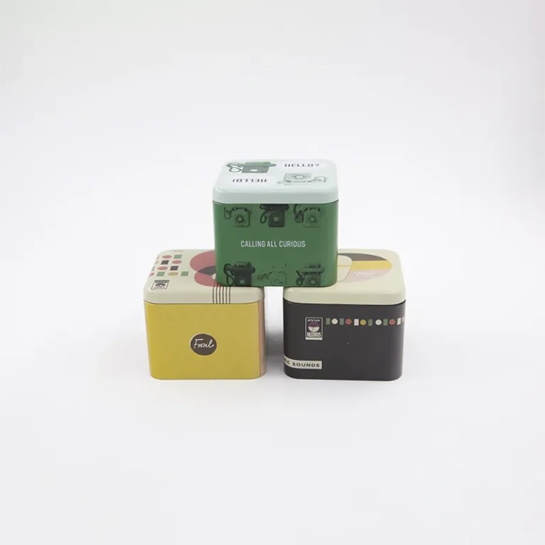
Textured Finishes: Anti-Slip, Wrinkle, Sand, and More
Texture is one of the most underrated upgrades for a Metal Tin Box. A textured varnish changes not only the look but also the grip, feel, and perceived quality. Textures can also hide small wear marks better than perfectly smooth surfaces.
Textured finishes are often used for tool tins, gift tins that need a “crafted” feel, and premium packaging that aims to stand out by touch. They can also reduce the appearance of fingerprints and small scratches.
Common textured finish options
Wrinkle or crinkle finishes create a rugged surface that feels industrial and durable. Sand-texture or fine-grain varnish offers a subtle tactile feel that feels premium and modern. Leather-like or soft-grain textures are used for luxury gifting and cosmetics where touch is part of the experience.
Texture selection should consider cleaning and dust. Deep textures can trap dust more easily, so if the tin must stay pristine in retail, a fine texture may be better than a heavy wrinkle.
When texture adds real functional value
For tins that are opened frequently, texture can improve grip. For tins used in workshops or outdoor environments, textured coatings can hide wear and feel less slippery. If your tin will be used as a storage box long after the product is consumed, texture helps it feel like a durable item rather than disposable packaging.
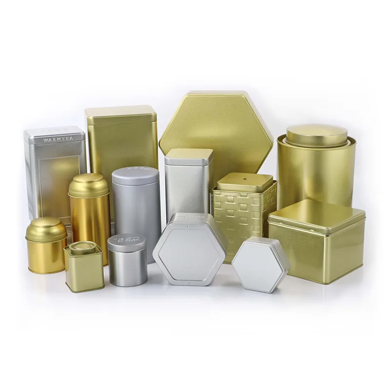
Metallic Looks: Brushed, Pearlescent, and Special Effects
Many brands want a Metal Tin Box that visibly says “metal” instead of looking like a printed paper label on steel. Metallic finishes help you achieve that. You can create metallic looks through ink systems, varnishes, or substrate effects depending on the design.
Metallic looks are especially popular for premium confectionery, spirits accessories, watch packaging, and collectible tins. They communicate durability, value, and craftsmanship.
Brushed metal and “bare metal” styles
A brushed look suggests industrial precision and modern design. It pairs well with monochrome graphics, minimal typography, and high-end tech branding. To achieve this effect, the design and process must be planned so the “metal feel” remains visible and not fully covered by opaque inks.
Bare-metal looks also require strong protective varnish. Without protection, the surface can show oxidation marks or handling wear more easily.
Pearlescent and shimmering finishes
Pearlescent varnishes and special inks create a soft shimmer rather than a strong mirror reflection. This is a great option when you want premium elegance without aggressive shine. It also performs well in gift and cosmetic markets where subtle visual texture reads as luxury.
Special effects should be tested with your exact artwork. The effect can look different depending on color coverage, pattern density, and lighting conditions.
Soft-Touch Finish: Premium Feel That Customers Remember
Soft-touch (sometimes called velvet-touch) finish is designed to feel smooth and slightly rubberized. It immediately signals premium quality because it’s unusual in typical mass-market tins. Many luxury brands use soft-touch on packaging because it creates an emotional response through touch.
Soft-touch can be used across cosmetics, wellness, premium chocolate, and high-end gifting. It can also be used for promotional tins that need to feel expensive even at moderate unit cost.
Benefits of soft-touch on a Metal Tin Box
Soft-touch improves grip, reduces glare, and feels warm compared to cold metal. It also makes embossing feel more dramatic because the contrast between smooth raised elements and the soft surface is strong. In photography, soft-touch usually looks clean and upscale.
However, soft-touch can be more sensitive to abrasion and may show “polishing” in high-contact areas. If your packaging will be handled heavily in retail or shipped loosely, you should combine soft-touch with strong logistics protection and realistic wear expectations.
Best practices for soft-touch projects
Soft-touch works best with clean designs and premium typography. It also pairs well with spot UV logos and hot foil accents because those elements “pop” against the muted surface. If you want a signature premium tin, soft-touch is one of the strongest finishing moves you can make.
Spot UV, Gloss Accents, and Contrast Finishing
Contrast is what makes packaging feel expensive. Instead of choosing only matte or only gloss, many premium tins use a base finish (often matte or satin) and then apply selective glossy areas through spot UV or spot varnish. This creates both visual and tactile highlights.
Contrast finishing is also an efficient way to upgrade perceived value. You don’t need complex structure changes to make the tin feel premium; you need smart finishing architecture.
How spot UV works in tin packaging
Spot UV is a controlled application of glossy, often UV-cured varnish on specific design areas like logos, borders, or patterns. It creates shine where you want attention and keeps the rest calm. It’s commonly used for brand marks, icon patterns, and premium labeling effects.
Spot UV requires precise registration. That means the artwork preparation and printing process must be aligned, and samples are essential for approval.
Where selective gloss is most effective
Selective gloss works best when the base finish is matte or satin. The contrast is stronger, and the result looks intentional. If your base is already glossy, spot UV may not be noticeable enough to justify the added process.
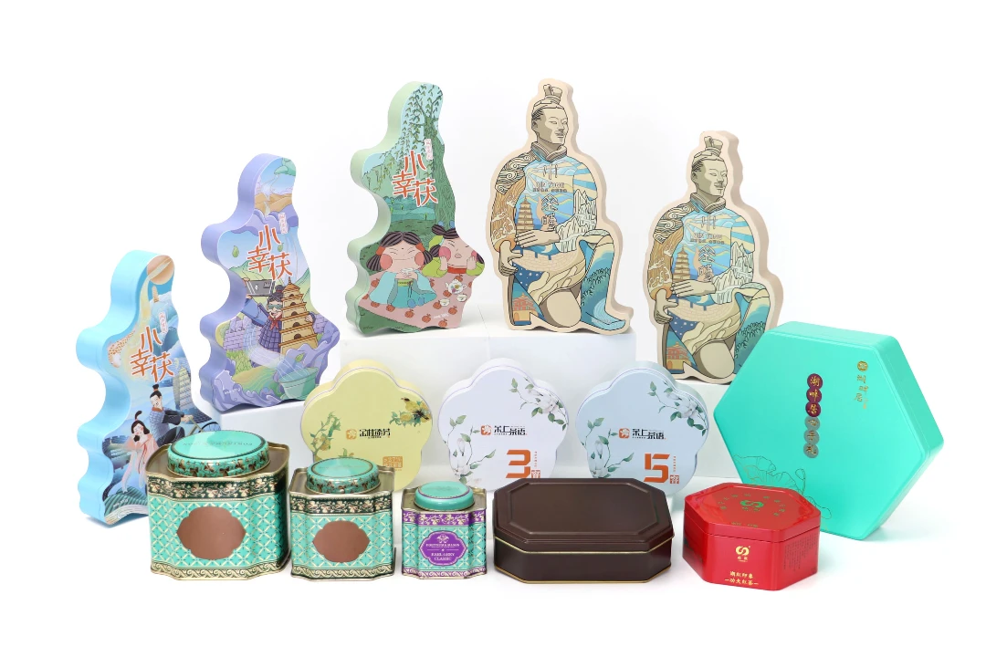
Embossing, Debossing, and 3D Effects
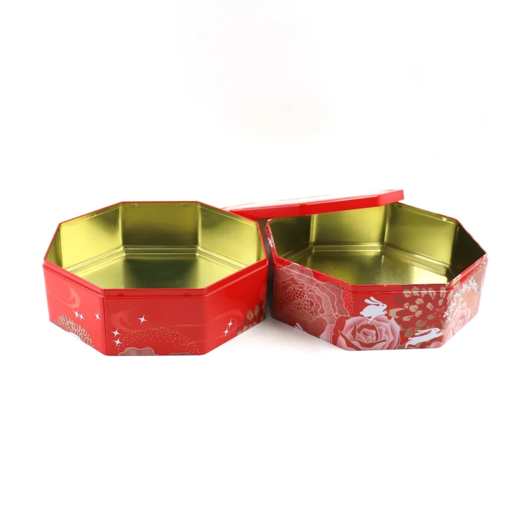
Structural finishing techniques like embossing (raised) and debossing (pressed-in) add tactile depth. These effects work extremely well on a Metal Tin Box because metal holds shape cleanly, and the result looks durable and intentional. Many collectible tins and gift tins use embossing to create a memorable unboxing experience.
Embossing can be subtle or dramatic. Even a small logo emboss can increase perceived value when combined with matte or soft-touch finish.
Combining embossing with surface finishes
Embossing looks more premium when the surface finish supports it. Matte and soft-touch make embossing feel tactile, while glossy can make it look shiny and decorative. You can also emboss patterns and then use spot UV only on the raised areas for a high-end effect.
For complex 3D embossing, you need careful tooling design. You should confirm feasibility early because emboss depth and line detail depend on tin thickness and forming constraints.
Practical considerations for embossing tooling
Embossing typically requires custom tooling, which affects cost and lead time. The benefit is consistency: once the tooling is correct, every tin in mass production will have the same tactile signature. If your tin is used for recurring seasonal products, embossing can pay back quickly as a reusable brand asset.
Protective Coatings and Durability: What Buyers Should Ask For
A beautiful finish is useless if it fails after shipping. For Metal Tin Box projects, durability is usually about scuff resistance, abrasion resistance, adhesion, corrosion protection, and color stability. The correct protective varnish or lacquer helps your tin stay attractive from factory to customer.
Many factories test coatings using standardized methods. For example, adhesion is often evaluated using cross-cut approaches like ASTM D3359 (https://www.astm.org/d3359) or ISO 2409 (https://www.iso.org/standard/50214.html). Corrosion resistance may be evaluated with salt spray testing such as ASTM B117 (https://www.astm.org/b0117) or ISO 9227 (https://www.iso.org/standard/63543.html).
Scuff resistance and rub resistance
Scuffing happens when tins rub against each other in cartons or during pallet vibration. A stronger topcoat can reduce visible scuffs, while proper packing can reduce the root cause. If your market demands pristine graphics, you should consider both coating and packaging strategy together.
Rub resistance matters when tins are handled repeatedly. If your customer opens the lid daily, you need a finish that maintains appearance after repeated contact.
Corrosion protection and humidity performance
Metal packaging must handle storage conditions. If your tins will sit in humid warehouses or ships, corrosion protection becomes important. Protective coatings help, but design also matters: sharp edges and unprotected seams can become weak points.
If you sell in coastal regions or ship globally, consider a more robust coating system and request performance data or comparable project references from your supplier.
Food-Grade and Sensitive Product Applications

Many Metal Tin Box projects are used for food, candy, tea, coffee, spices, or edible powders. In these cases, internal coatings and compliance documentation are essential. The goal is to prevent direct metal contact, avoid corrosion, and meet regulatory expectations in your target market.
If you ship to the United States, you may want to align your project with FDA packaging guidance such as Food Contact Substances information (https://www.fda.gov/food/food-ingredients-packaging/food-contact-substances-fcs). If you ship to Europe, align with EU framework rules and guidance for food contact materials (https://food.ec.europa.eu/safety/chemical-safety/food-contact-materials_en).
Internal lacquer options and common choices
Internal coatings are often clear, gold-tone, or white depending on the application and appearance needs. The coating should be compatible with your product, especially if it contains oils, acids, or strong aromas. A well-selected internal lacquer helps protect both the contents and the tin.
You should request documentation and, if needed, third-party testing aligned with your destination market requirements. Compliance is not only about the coating formula, but also about process control and traceability.
“BPA-free” and compliance language
Many buyers ask about BPA. Some coating systems are marketed as BPA-NI or BPA-free, but acceptable claims depend on region, supplier documentation, and the exact application. The safe approach is to request clear compliance statements and test reports for your target market and product type, rather than relying on broad marketing labels.
How to Choose the Right Finish for Your Product Category
The “best” finish depends on your product category, sales channel, and customer behavior. A tin sold as a gift has different priorities than a tin used daily in a kitchen. The smart strategy is to choose finishes that support your brand story while surviving real-world handling.
Below are practical recommendations based on typical Metal Tin Box use cases. Each recommendation should still be confirmed by sample, because artwork and colors can change how a finish appears.
Confectionery, biscuits, seasonal gift tins
Glossy or satin finishes are common because they deliver bright shelf impact. Spot UV on a satin base adds premium contrast without making the whole tin a fingerprint surface. Embossed lids are also popular for collectible holiday tins.
If your tins are stacked in high-volume retail, prioritize scuff resistance and packing protection. A slightly stronger varnish can reduce returns caused by cosmetic damage.
Tea, coffee, spices, and premium pantry storage
Matte, satin, or fine-texture finishes fit premium pantry products and photograph well. These tins are often reused, so durability and cleaning performance matter. Anti-fingerprint or higher-wear matte varnish is a strong option for dark colors.
Internal coating is critical for aroma products. You want the tin to protect flavor and prevent corrosion or odor interaction.
Cosmetics, wellness, and personal care
Soft-touch is a powerful upgrade for cosmetics and wellness packaging. Matte + spot UV also works well for clean, modern branding. If the product is carried in bags, make sure the finish resists scratches and rubbing against other items.
For balms or oily products, internal coating compatibility is important. You should share product characteristics early so the factory can recommend the correct internal lacquer.
Hardware kits, tools, and industrial parts
Wrinkle, textured, or semi-gloss finishes can look durable and hide wear. Brushed metal styles also match industrial branding. For these tins, protection against abrasion and corrosion is often more important than perfect showroom gloss.
If the tin may be exposed to oil or grease, choose coatings that resist staining and wipe clean easily. Practical performance usually beats “perfect looks” in industrial markets.
Cost and Lead Time: How Finish Choices Change the Quote
Finish affects cost in multiple ways: coating materials, extra process steps, tooling, and quality control. Matte vs. glossy is not always a big price difference, but specialty textures, soft-touch, spot UV, and embossing can add noticeable cost depending on volume and complexity.
Lead time changes too. Effects that require additional curing, extra print passes, or custom tooling generally take longer, especially for the first production. If your launch schedule is tight, consider starting with a simpler finish and adding premium effects in a second version.
Typical cost drivers to watch
Custom embossing tooling increases upfront cost but is spread across your total quantity. Spot UV and multiple varnish layers add process steps and require careful alignment. Soft-touch coatings may have higher material cost and stricter handling requirements during packing.
If your budget is limited, focus on one “hero” upgrade. A satin base + spot UV logo can deliver premium impact at a more controlled cost than multiple special effects at once.
How to reduce risk without sacrificing quality
The best risk reduction tool is sampling. Approve a finished physical sample and confirm it under your target lighting, not only on a digital screen. You can also run a small pilot batch before committing to full volume, especially for high-end finishes like soft-touch or heavy texture.
How to Specify a Metal Tin Box Finish Clearly
Clear specs help your supplier deliver exactly what you want. Many finishing problems come from vague instructions like “matte but not too matte” or “shiny premium.” You can avoid that by providing reference targets and defining what matters most: appearance, feel, durability, or compliance.
A good specification balances technical detail with practical communication. You don’t need to over-engineer it, but you do need to eliminate ambiguity.
What to include in your finish specification
Include the base finish (matte/satin/gloss), whether you want spot UV, whether metallic effects are required, and whether embossing is included. Mention your target market and use case, because a factory may recommend a different topcoat for heavy handling than for display-only tins.
Also include artwork requirements like Pantone colors, minimum line thickness, and whether you need color matching across multiple SKUs. Finish interacts with printing, so you should treat them as one system.
Always approve with physical samples
Screens lie, especially for gloss and texture. Approving only a digital proof is risky because it cannot show real reflection, real tactile feel, or real scratch behavior. A physical finished sample is the most reliable reference for mass production consistency.
Sustainability and Recyclability Considerations
A Metal Tin Box is often chosen because it is reusable and feels durable. Many brands also value metal packaging for its recycling potential and long-life reuse behavior. To support sustainability messaging, you should focus on realistic claims: durability, reusability, and compatibility with established recycling systems.
If you want to reference industry recycling information in your branding strategy, you can consult organizations such as Metal Packaging Europe (https://metalpackagingeurope.org/) and the World Steel Association (https://worldsteel.org/). Your finish choice can also support sustainability by reducing damage and returns, which lowers waste in the supply chain.
Finishes that support long-term reuse
Matte, satin, and textured finishes often look good even after months of use because they hide minor wear better than high-gloss mirror finishes. A durable topcoat also helps tins survive years of reuse without looking “tired.” If reuse is part of your brand story, choose a finish that ages gracefully.
Sustainability also includes logistics efficiency. Strong finishes plus protective packing reduce cosmetic rejects, which saves material and cost.
Quick Finish Selection Guide: Which One Should You Choose?
If you need a practical starting point, here’s a simple way to decide. First choose a base finish, then add one premium accent if needed. This avoids overcomplicating the project while still delivering a strong market result.
Matte is best when your brand is modern and premium, and when photography matters. Glossy is best when shelf impact and vibrant color are priorities. Satin is best when you want a balanced premium look with broad practicality.
Recommended “safe premium” combinations
A satin base + spot UV logo delivers high perceived value with controlled risk. Matte base + embossing also looks premium and feels memorable. Soft-touch base + spot UV logo is a signature luxury combination when your budget and protection strategy can support it.
When in doubt, choose satin. It works in most markets and gives you flexibility to add contrast effects without creating too many handling issues.
Build a Better Metal Tin Box with the Right Finish
Choosing the right Metal Tin Box finishing option is one of the easiest ways to upgrade perceived quality without changing the structure. Matte, glossy, satin, texture, soft-touch, metallic looks, spot UV, and embossing each create a different customer experience. The best choice depends on your brand positioning, use case, sales channel, and logistics reality.
If you want consistent mass production results, treat finish as a system: substrate + printing + varnish + curing + packing. Define your target clearly, approve real samples, and work with a factory that can explain trade-offs honestly. When finishing is done right, your tin isn’t just packaging—it becomes a durable brand asset customers want to keep.